Redesigning the Website for a Funky Mexican Restaurant
El Chupacabra
Overview
Often described as a punk rock cantina, El Chupacabra has been one of the most extraordinary Mexican restaurants in Seattle since 2005. Besides its mission-style Mexican food and famous margaritas, its post-punk atmosphere, hard rock tunes, and excellent view from the deck provide customers with an unforgettable experience.
For the 10-week UI/Visual for Website class, I redesigned a new responsive website to improve the user experience and to make the site better represent El Chupacabra’s brand culture. This was an individual project focused on UI/visual design with some UX thinking.
My Role
UX/UI Designer,
Art Director
Wireframing, Interface design, Prototyping, Art direction
Timeline
10 Weeks
Tools
Figma, Figma Mirror, Photoshop, Illustrator

CHALLENGES
Not Attracting Potential New Customers
El Chupacabra’s website fails to meet users' needs due to its content-heavy layout that lacks a clear grid system and intuitive navigation structure, and is not responsive. It also fails to represent El Chupacabra’s brand culture. These problems could cause El Chupacabra to miss opportunities to gain new customers who are looking for a restaurant by browsing websites on their phone.
Goal
Appealing Responsive Design
● To reduce the amount of overall content, and make the site more streamlined and effective.
● To provide El Chupacabra’s brand culture with visual elements so it can motivate new customers to visit El Chupacabra.
● To create a mobile-friendly design that meets the needs of the more than 50% of users who access the site on mobile devices.
Audience
Summer Crowds and Local Regulars
El Chupacabra’s customers tend to be young to middle-age professionals, but the specific audience varied between its two locations. The Alki location attracts a summer crowd that is younger and more lively, while the Greenwood location attracts local young professionals including many regulars. In both locations, many customers choose El Chupacabra for its robust happy hour.
User Scenario
As a new Seattle resident, I want to find about restaurants and bars in my area so that I can have my regular hang-out place.”
Brand Attributes
Kitschy, Funky, and Playful
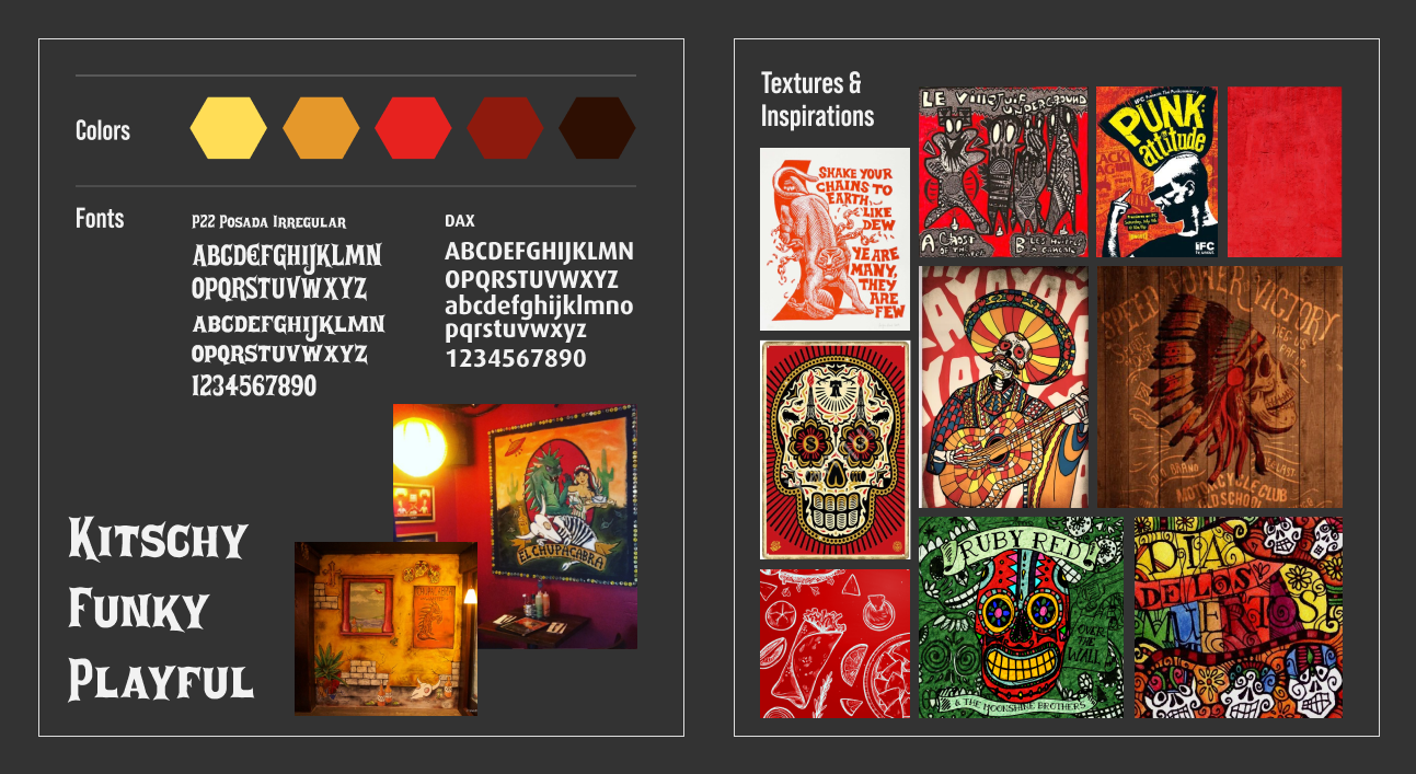
El Chupacabra’s visual aesthetic is very unique, with its funky interior decoration and punk rock music, yet it still provides friendly and playful atmosphere. To describe it’s brand culture, I chose these three keywords: Kitschy, Funky, and Playful.
Mood Board
With these three keywords in mind, I gathered inspirational images to help me understand and express my design direction. My intent was to recreate the flavor of El Chupacabra’s rustic art and its red concrete walls, which customers immediately notice when coming into the building.
Site Map
The current website has two primary forms of navigation, located at the top and left sides of the screen, which creates confusion. To simplify the user flow, I combined them into a singular global navigation. I also consolidated the pages for “Back story”, “Location information”, “Press”, and “Gallery” into a new “Our Story” section to provide a clearer user flow.

Wireframe
One of the goals for this project was to create mobile-friendly designs. To ensure that the design will function well on all devices, I decided to go with a 12-column layout for desktop and tablet, and a 4-column layout for mobile.

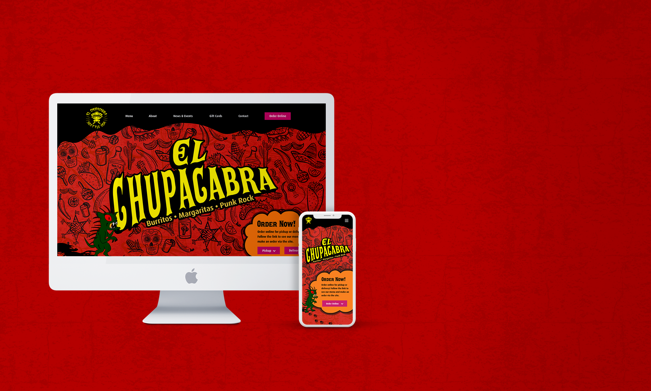
Home page

“About Us” page.
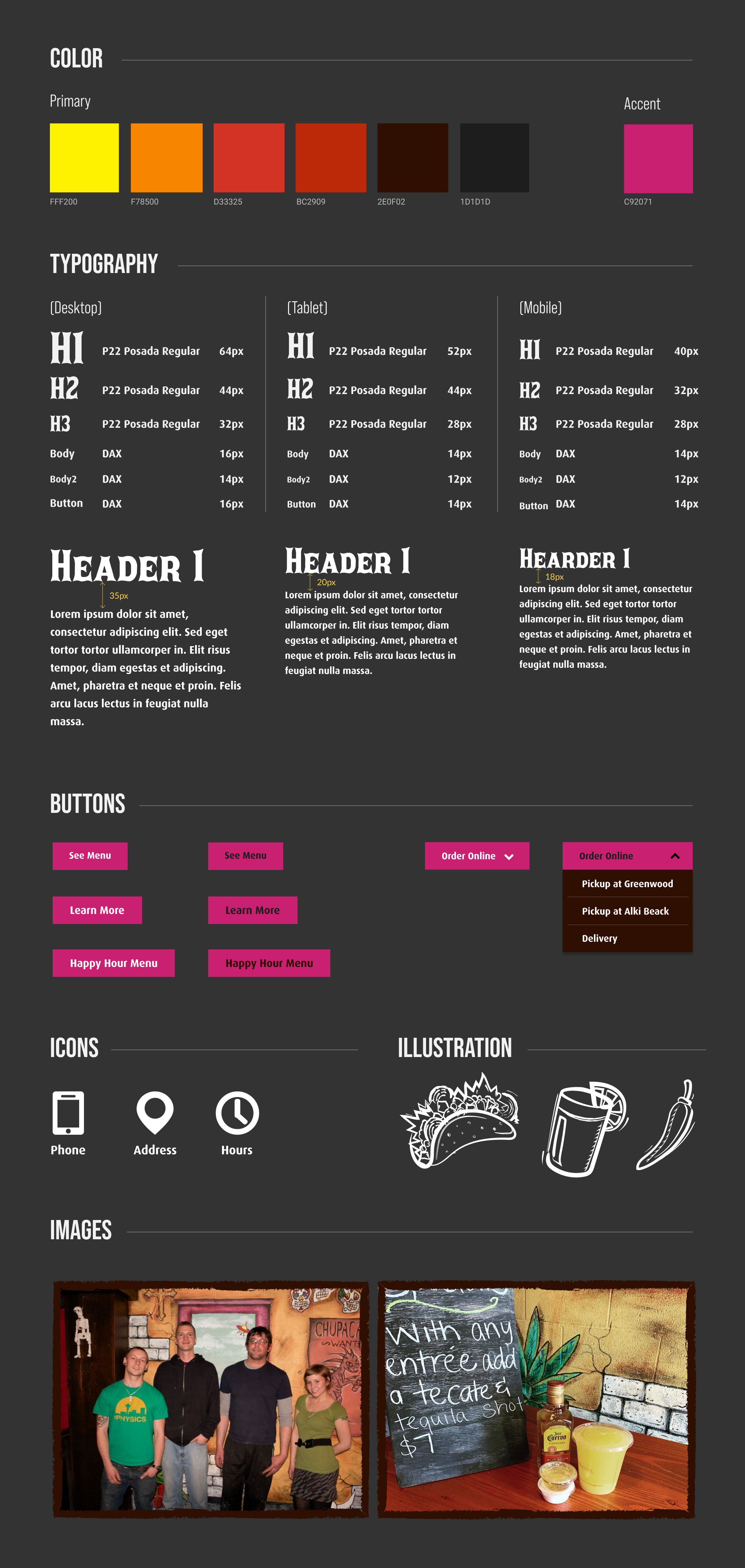
Style Guide
Based on my initial mood board, I developed a style guide to establish a consistent design language. I selected a color palette and illustration style inspired by El Chupacabra’s interior decor, and the font P22 Posada Irregular—inspired by Mexican posters and arts— which has a somewhat sinister appearance similar to that of El Chupacabra’s devil mascot.
Revisions
Feedback is key to learning
Each week, we spent time in class critiquing one another’s designs. With the feedback I received from my classmates, I developed a final design solution.
Version 1
The illustrations in the global navigation were too much.

Version 2
The navigation looked much more intuitive without the illustrations. I also refined the page layouts, but the sections of the site felt disconnected and the content felt somewhat disorganized.

Version 3
I added footsteps to connect the sections of the site, creating a clear flow through the content of the page. With this version, I noticed the button shape was a little distracting, so I changed the shape to a rectangle for the final version.

Solution
A simple, dynamic user flow
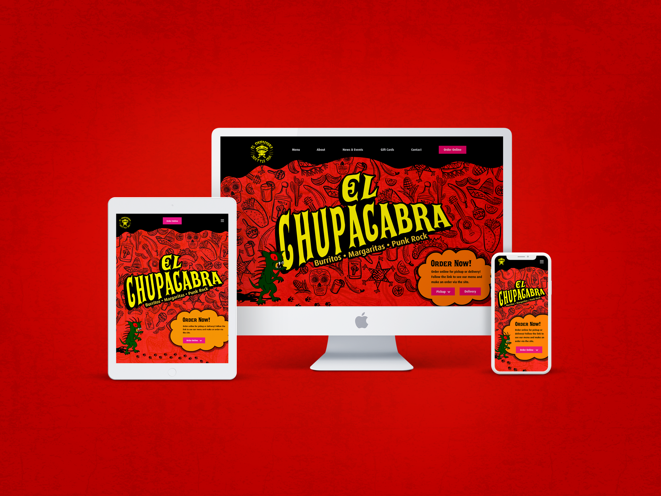
With its flexible grid system, the design works well on all devices.
Home page
The style of the illustration, typography, and colors represent El Chupacabra’s culture.
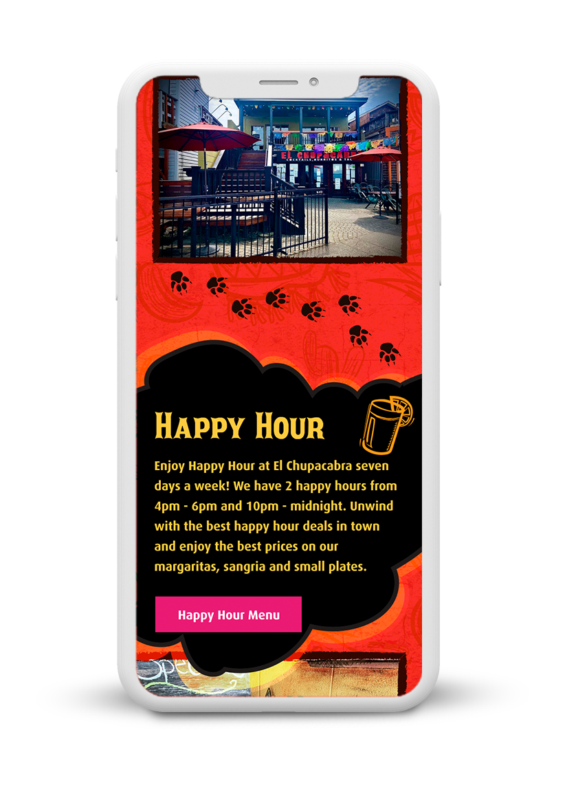
The design tells the story of el chupacabra enjoying the food and drinks and ending up with a full stomach.

An imperfect stroke around the images, inspired by the human hand, also represent El Chupacabra’s playful brand culture.

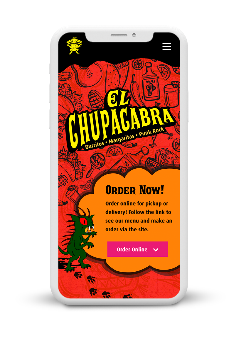
The footsteps unite each element and direct the eye through the composition.
“About Us” page
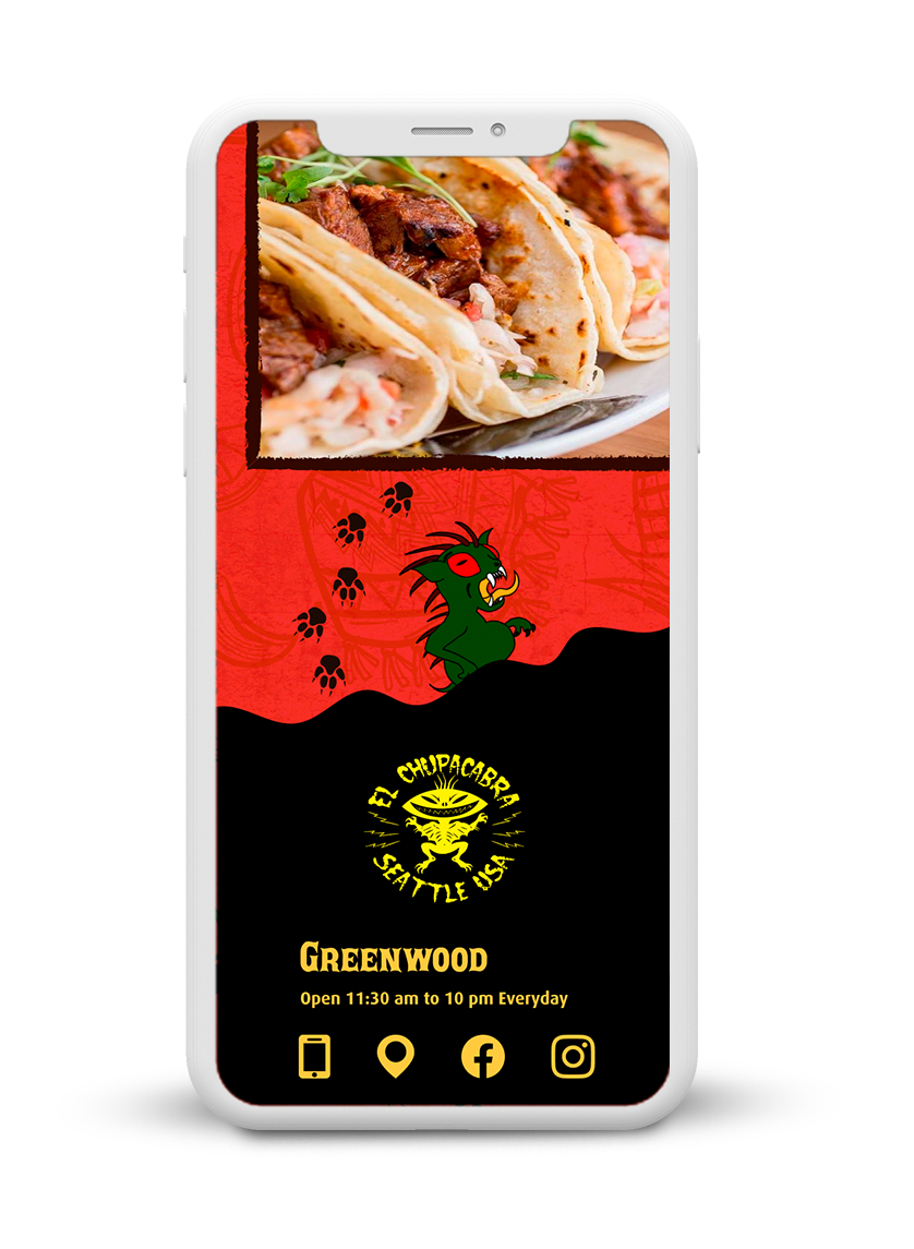
I edited the content of the “Our Story” page to be more succinct. Adding a staff picture creates a more personal connection to potential new customers.

A simple scannable footer also helps users find what they need.

RESULT
Feedback from Test Users
“
“
The wonderful design with the El Chupacabra’s atmosphere!
— Creg B.
My eyes naturally move to each section by following the footsteps.
— Shelly H.
“
“
I enjoy the little el chupacabra’s story having the food/drinks!
— Mike K.
Much easier to find out who El Chupacabra is!
— Craig B.
LEARNING & Next step
A More UX-centric Approach
The main purpose of this class was to design a site that is a more accurate portrayal of a company’s brand. As such, I focused primarily on visual design during this project. However, if I had more time, I would love to conduct UX research to better understand users’ pain points.

